February 8th - 2022: Something isn't Retro Unless it Has Gone Away for Awhile
- havenmilne20
- Feb 8, 2022
- 2 min read
Updated: Feb 11, 2022
The Evolution of Wasted Graphic Design:

Recently, when doing research into this project (and half heartedly just scrolling through the internet for interesting things to watch, I came across a video which talked about how President Nixon had pushed during the early 70s, for graphic design to be pushed and strengthened, as he saw it as important! Most noticeably in certain major national departments, like the in military and parks, but I focusing more on something out of this world...yeah, literally.
I am talking about NASA. For a number of years, since its creation at the beginning of the 60s in part with the famous space race with Russia, mainly sparked by Sputnik, the graphic design and art used by NASA across all their departments was bland and not very interesting.
So, there was a spark, created by two men, Richard Danne and Bruce Blackburn, along with the help of the Danne & Blackburn Staff. These two men pioneered a new sense of graphic design, helping to shape the look and feel of NASA, presenting it with a stronger, bolder, more serious and exploratory look and presentation towards the public eye. No longer just a company that wanted to shoot men into space, but an organisation that wanted to reach and claim the stars. Even though they has previously landed on the moon more than once.
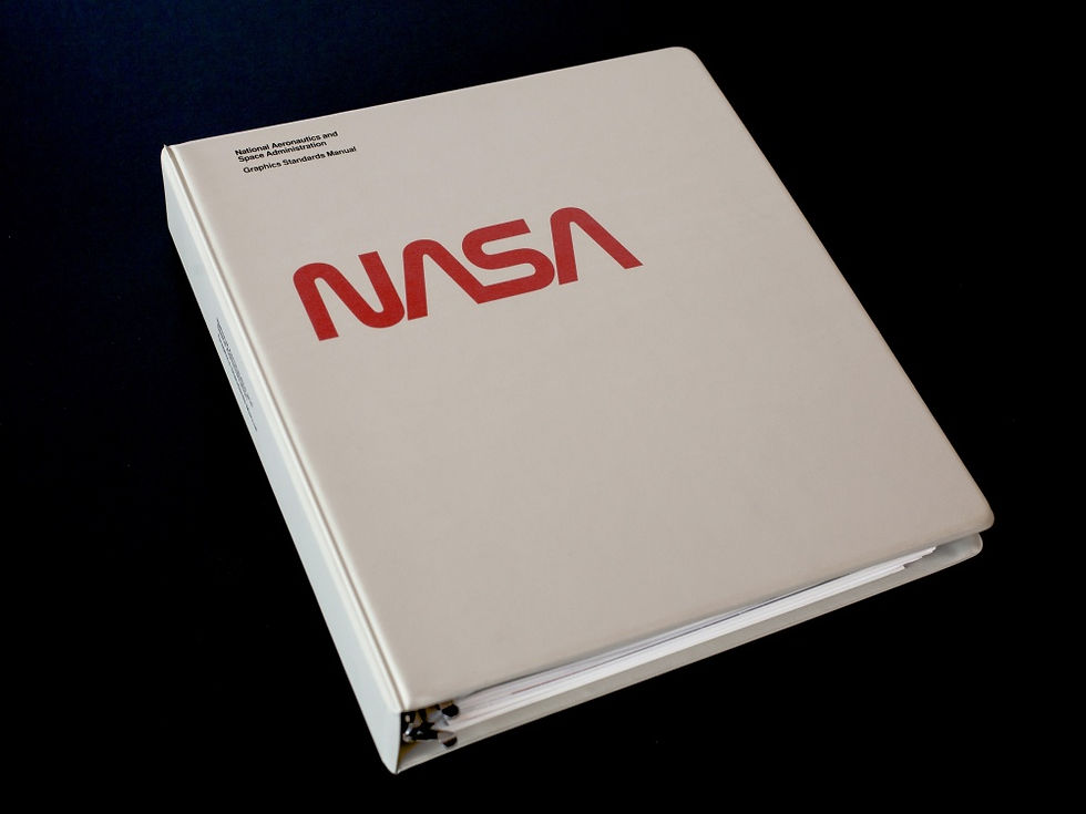
These two men, and the help of their colleagues/employees, created the NASA: Graphics Standards Manual, a binder (now a book, I'll get to that in a second which was given out to the staff of NASA and all its departments, detailing all the new rules and regulations of how the NASA logo was to presented, shaped, sized, coloured and so on, giving the company a constant unified design.
Now, even though said manual was essentially a rulebook, it is also a gorgeous and stunning piece of artwork. Each page is astounding, its paper doll like drawings of clothes, items, posters and vehicles, all laid out in the exact ways that the book says NASA documents should be, it is as if the book is almost writing itself.
Now, about it being originally a binder, and now a book. In the mid 2010s, there was a Kickstarter to raise funds in order to start reprinting the manual for the public viewing and ownership. The book is brilliant, a page turner which lacks an unneeded plot.
Yet. YET! There is a sad tide to every tale, the heads to a tail on a coin. Even though the graphics in this manual are amazing, and helped make NASA was it is today in the scheme of style and appearance to the public, it didn't last long. Eventually, the worm was scrapped and NASA decided to go in reverse and carry on driving down the highway and not take the exit (which was the NASA worm) and continue their journey with their old logo and styling, the globe logo (shown below).


Comments